
Exploring Open Access Art Using the Deno Jupyter Kernel
Jupyter notebooks are the de facto standard for interactive computing and data analysis, combining code, prose, and visualizations in a single document.
In fact, this post was written in a notebook!
Deno is a simplified and secure runtime for JavaScript and TypeScript, with built-in tooling and modern defaults. Since v1.37, Deno ships with a built-in Jupyter kernel, making it easy to use TypeScript for data science and interactive computing.
Having worked extensively with computational notebooks (mainly in Python), I find this exciting for these reasons:
- Simple setup — The kernel is built into the Deno CLI, so there’s no need for additional installation. Just install Deno.
- Improved dependency management — Notebooks run like standalone scripts, and Deno’s support for importing dependencies in the code itself improves dependency management and reproducibility.
- A unified ecosystem for interactive data analysis — Jupyter supports rich HTML/CSS/JS outputs, and the JavaScript ecosystem is ideal for interactive UIs. Deno connects the kernel and frontend, making notebooks more powerful and flexible.
In this post, we’ll explore the National Gallery of Art’s Open Access dataset in Jupyter with Deno. We’ll clean and analyze the data, looking at public domain works, artists, origins, and patterns. Along the way, we’ll introduce Deno-compatible tools like npm:nodejs-polars and npm:@observablehq/plot, and wrap up by adding widgets and custom displays for a more interactive experience.
The dataset
The National Gallery of Art (NGA) Open Data Program provides access to over 130,000 artworks and their creators, available on GitHub. This dataset includes valuable metadata such as titles, dates, artists, and classifications, all under a Creative Commons 0 (CC0) license, meaning it’s free to use and share.
The collection spans a wide variety of artworks, from sculptures to paintings, by famous artists like Mary Cassatt, M.C. Escher, Vincent van Gogh, Pablo Picasso, and Georgia O’Keeffe.
However, navigating this resource is challenging. The National Gallery’s website is not very user-friendly, making it difficult to make sense of what is actually in the dataset. It’s nearly impossible to get any high-level insights, like the number of paintings, which time periods are most represented, or which artists are most prevalent–let alone make specific queries.
Fortunately, the dataset is available on GitHub as a collection of related tables, exported as CSV files. For our analysis, we’ll focus on three key tables:
- objects.csv — Metadata about artworks, including titles, dates, materials, and classifications.
- constituents.csv — Artist details such as names, nationalities, and lifespans.
- published_images.csv — Links to artwork images via the NGA’s IIIF API.
We’ll clean and join these tables to create a unified dataset.
But wait!
While these NGA tables are free to use, they only include metadata. The actual artwork images have separate licensing, with only about half being CC0-licensed. We’ll gather this info separately to identify freely available images.
Our goal is to unify the data to identify public domain images, explore subsets, and view available artworks. Maybe you’ll even find an upgrade for that default OS wallpaper.
Loading and cleaning the data
Open Access dataset
To get started, we first need to download the data. If you’ve worked with CSVs in JavaScript before, this typically looks like a “fetch” request followed by some parsing. Here, we’re using jsr:@std/csv to stream the data, which gives us an array of objects.
import * as csv from "jsr:@std/csv";

let baseUrl = new URL(
  "https://github.com/NationalGalleryOfArt/opendata/raw/refs/heads/main/data/",
);
let response = await fetch(new URL("objects.csv", baseUrl));

let objects = await Array.fromAsync(
  response.body.pipeThrough(new TextDecoderStream()).pipeThrough(
    new csv.CsvParseStream({ skipFirstRow: true }),
  ),
  (row) => ({
    objectid: +row.objectid,
    title: row.title,
    year: +row.beginyear,
    medium: row.medium,
    type: row.visualbrowserclassification,
  }),
);

objects.slice(0, 3);
[
  {
    "objectid": 0,
    "title": "Saint James Major",
    "year": 1310,
    "medium": "tempera on panel",
    "type": "painting"
  },
  {
    "objectid": 1,
    "title": "Saint Paul and a Group of Worshippers",
    "year": 1333,
    "medium": "tempera on panel",
    "type": "painting"
  },
  {
    "objectid": 4,
    "title": "Saint Bernard and Saint Catherine of Alexandria with the Virgin of the Annunciation [right panel]",
    "year": 1387,
    "medium": "tempera on poplar panel",
    "type": "painting"
  }
]
If we were just plotting the data, this would work fine. But an array of objects isn’t ideal for building our dataset. The NGA data is relational and needs merging, cleaning, and restructuring. A DataFrame is better suited for our use case, offering higher-level, efficient APIs that eliminate the need to write manipulation functions by hand.
Let’s see how we can load the same dataset using a DataFrame from npm:nodejs-polars:
import * as pl from "npm:nodejs-polars";

let response = await fetch(new URL("objects.csv", baseUrl));

let objects: pl.DataFrame = pl.readCSV(await response.text(), {
  quoteChar: '"',
});

objects = objects.select(
  pl.col("objectid"),
  pl.col("title"),
  pl.col("beginyear").as("year"),
  pl.col("medium"),
  pl.col("visualbrowserclassification").as("type"),
);

objects.head()
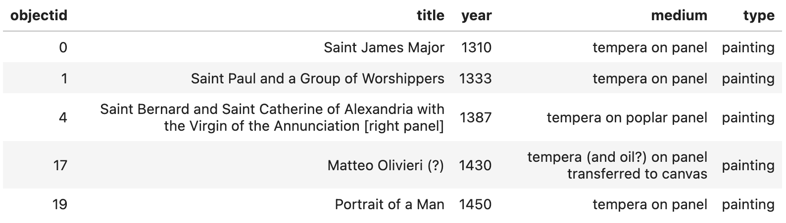
Here, we fetch the dataset as before, but instead of parsing the CSV ourselves, we read the text response directly with Polars to create a pl.DataFrame.
We then chain a .select expression to choose and rename the columns we want. Notice how, rather than operating on each row in a loop, with Polars we work directly with columns. This API allows us to express complex, efficient operations (in Rust) without materializing JavaScript objects.
Let’s load our other two datasets as pl.DataFrames as well:
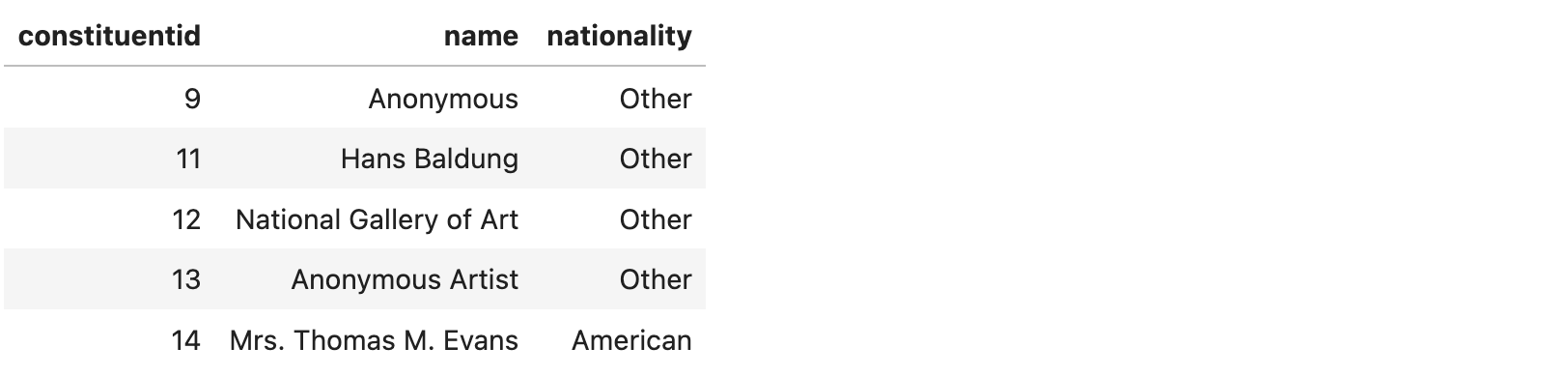
The constituents.csv table contains information about any person or entity associated with a piece of art, such as artists, curators, or collectors.
let response = await fetch(new URL("constituents.csv", baseUrl));
let constituents = pl.readCSV(await response.text(), { quoteChar: '"' })
  .select(
    pl.col("constituentid"),
    pl.col("forwarddisplayname").alias("name"),
    pl.col("visualbrowsernationality").alias("nationality"),
  );

constituents.head();
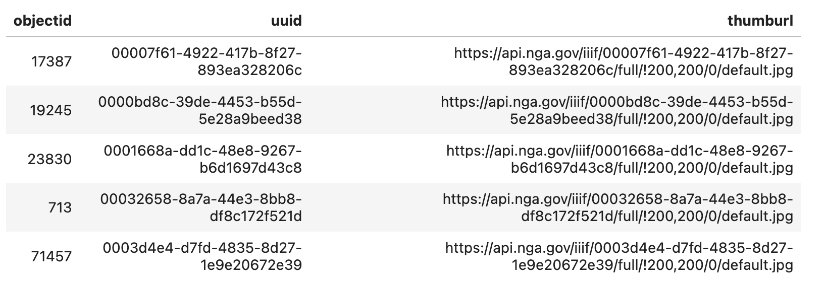
The published_images.csv table contains additional information about the artwork’s image, including a URL for the thumbnail and mapping the objectid to the IIIF (International Image Interoperability Framework) for the image.
let response = await fetch(new URL("published_images.csv", baseUrl));
let publishedImages = pl.readCSV(await response.text(), { quoteChar: '"' })
  .select(
    pl.col("depictstmsobjectid").alias("objectid"),
    pl.col("uuid"),
    pl.col("iiifthumburl").alias("thumburl"),
  );
publishedImages.head();
The final table, objects_constituents.csv, represents a many-to-many relationship between artworks and the people or entities associated with them. Each artwork may have multiple people linked to it.
For our analysis, we’re interested in selecting the “primary” constituent (i.e., the artist). We define the primary artist as the one with the highest displayorder for each object.
let response = await fetch(new URL("objects_constituents.csv", baseUrl));
let objectToArtist = pl.readCSV(await response.text(), { quoteChar: '"' })
  .filter(pl.col("role").eq(pl.lit("artist")))
  .sort({ by: "displayorder" })
  .groupBy("objectid")
  .first()
  .select("objectid", "constituentid");

objectToArtist.head();
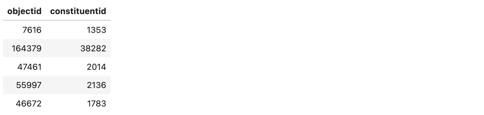
This is a much more advanced usage of Polars, so let’s break down what’s going on:
- Filter the table to select only rows where the role is “artist”.
- Sort the filtered data by displayorder to ensure all entries are at the top.
- Group the rows by objectid, ensuring one row per artwork.
- Get the first in each group (i.e., artist with highest display order).
- Select just the “objectid” and “constituentid” for joining our tables.
Writing this logic by hand in JavaScript would be tedius, but with Polars it’s declarative and reads like a sentence. This type of chaining is common when working with relational data.
Determining whether art is in public domain
We’ve loaded the relevant tables from the Open Access dataset, but they do not indicate whether images associated with an artwork are in the public domain. While CC0 images can be freely downloaded, shared, and repurposed, not all art with the CC0 license are legally in the public domain everywhere due to local copyright laws and edge cases.
Let’s find a way to add public domain information to our data set.
That information is available on the NGA website, but only through the search user interface. Extracting it manually would be impractical, so I reverse-engineered an API call to retrieve the IDs of artworks with public domain images.
We only need the IDs, not the full data, but the query is slow. Since this isn’t an official API, I’ve saved the results separately. There are about 50k IDs identifying public domain images in our dataset.
// This is not an official API, so I’ve cached the results to avoid
// repeatedly querying the server.
//
// let response = await fetch("https://www.nga.gov/bin/ngaweb/collection-search-result/search.pageSize__100000.pageNumber__1.lastFacet__artobj_downloadable.json?artobj_downloadable=Image_download_available");
// let data = await response.json();
// Deno.writeTextFileSync("public-domain-ids.txt", data.results.map((object) => object.id).join("\n"));

let publicDomainIds = Deno.readTextFileSync("public-domain-ids.txt")
  .split("\n").map((d) => +d);
“Join” to single unified table
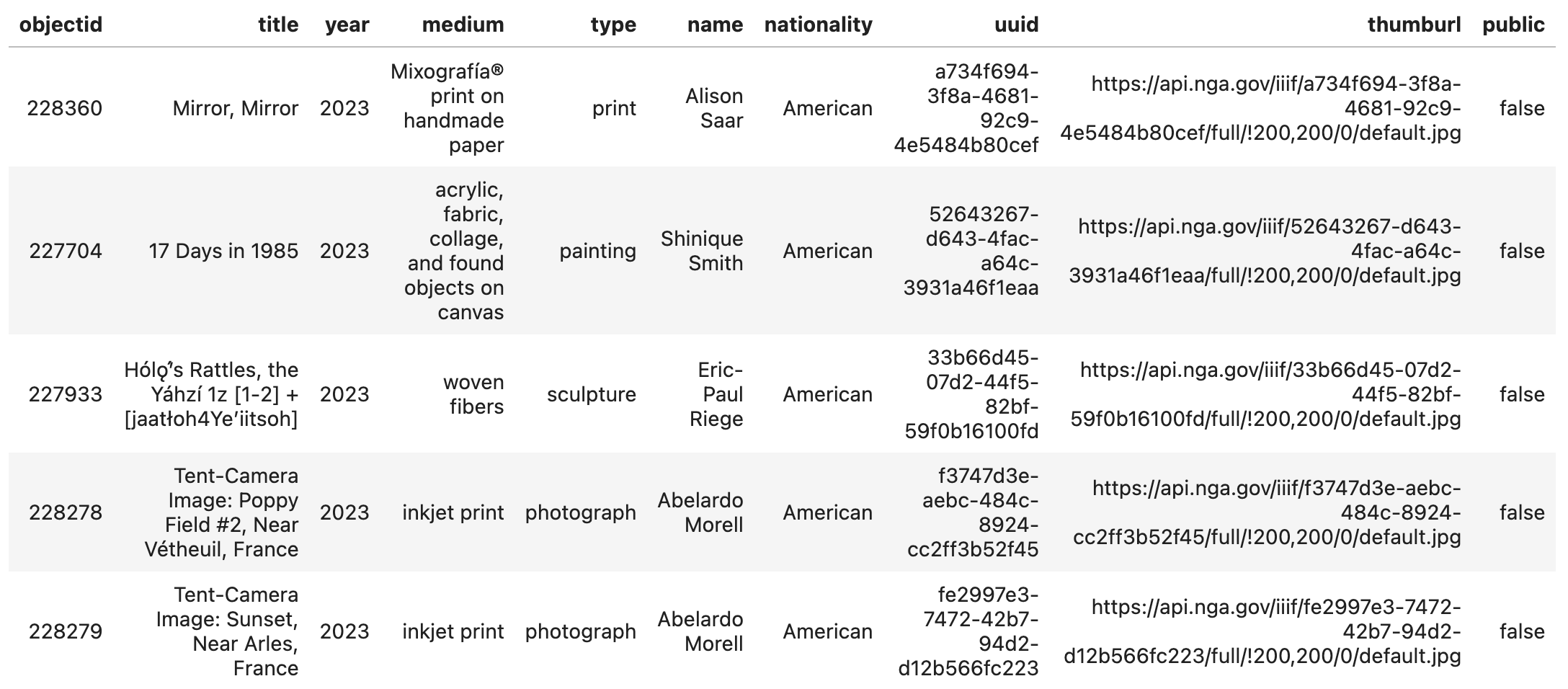
Now that we have all our data cleaned and loaded, we’ll perform a large join to combine all these tables into a single unified table.
Again, this challenging to do manually, but with Polars, we can nicely express these complex join operations. Finally, we use a .isIn expression to derive a new column that indicates whether a piece of art is public domain.
let df = objects
  .join(objectToArtist, { on: "objectid" })
  .join(constituents, { on: "constituentid" })
  .join(publishedImages, { on: "objectid" })
  .select(pl.exclude("constituentid"))
  .withColumns(pl.col("objectid").isIn(publicDomainIds).alias("public"))
  .sort({ by: "public" })
  .sort({ by: "year", descending: true, nullsLast: true });

df.head();
With our unified dataset finally loaded, let’s move on to some plotting.
Exploring art, who created it, when, and more with plots
The NGA portal allows some exploration of these data but focuses on specific artworks. We’re more interested in broader insights — where most art comes from, who created it, when it was made, and whether it’s public domain.
As a JavaScript/TypeScript runtime, Deno gives us access to many visualization libraries to ask these kinds of questions. We’ll use npm:@observablehq/plot (Observable Plot) to create plots, spot patterns, and better understand the collection.
Note this post is not a tutorial on Observable Plot, so don’t worry if some of the code below is not immediately clear. The goal is to demonstrate how to use Observable Plot in Jupyter with Deno to extract insights from our data. I’ll highlight any Deno-specific details or useful tips along the way.
Let’s start by examining the distribution of artworks across different “types” in the NGA collection.
import * as Plot from "npm:@observablehq/plot";
import { document } from "jsr:@manzt/jupyter-helper";

// Convert our DataFrame to Array<Object>
let records = df.toRecords();

Plot.plot({
  width: 900,
  marginLeft: 50,
  color: { legend: true },
  marks: [
    Plot.barY(
      records,
      Plot.groupX({ y: "count" }, {
        x: "type",
        sort: { x: "-y" },
        fill: (d) => d.public ? "Public domain" : "Copyrighted",
      }),
    ),
  ],
  // Provide a custom `document`
  document,
});
For the code above, the key things to keep in mind are:
- Custom document — Observable Plot relies on the browser DOM, but since we’re in Deno, we provide a custom document from jsr:@manzt/jupyter-helper to enable rendering.
- Converting our Polars DataFrame to records — Observable Plot works best with arrays of objects, so we use df.toRecords() to make the data easier to work with.
For specifics on the Plot API, see the documentation and examples available.
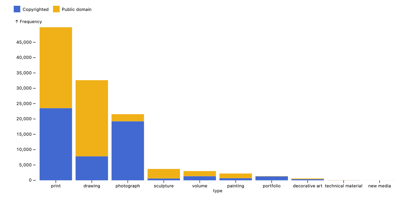
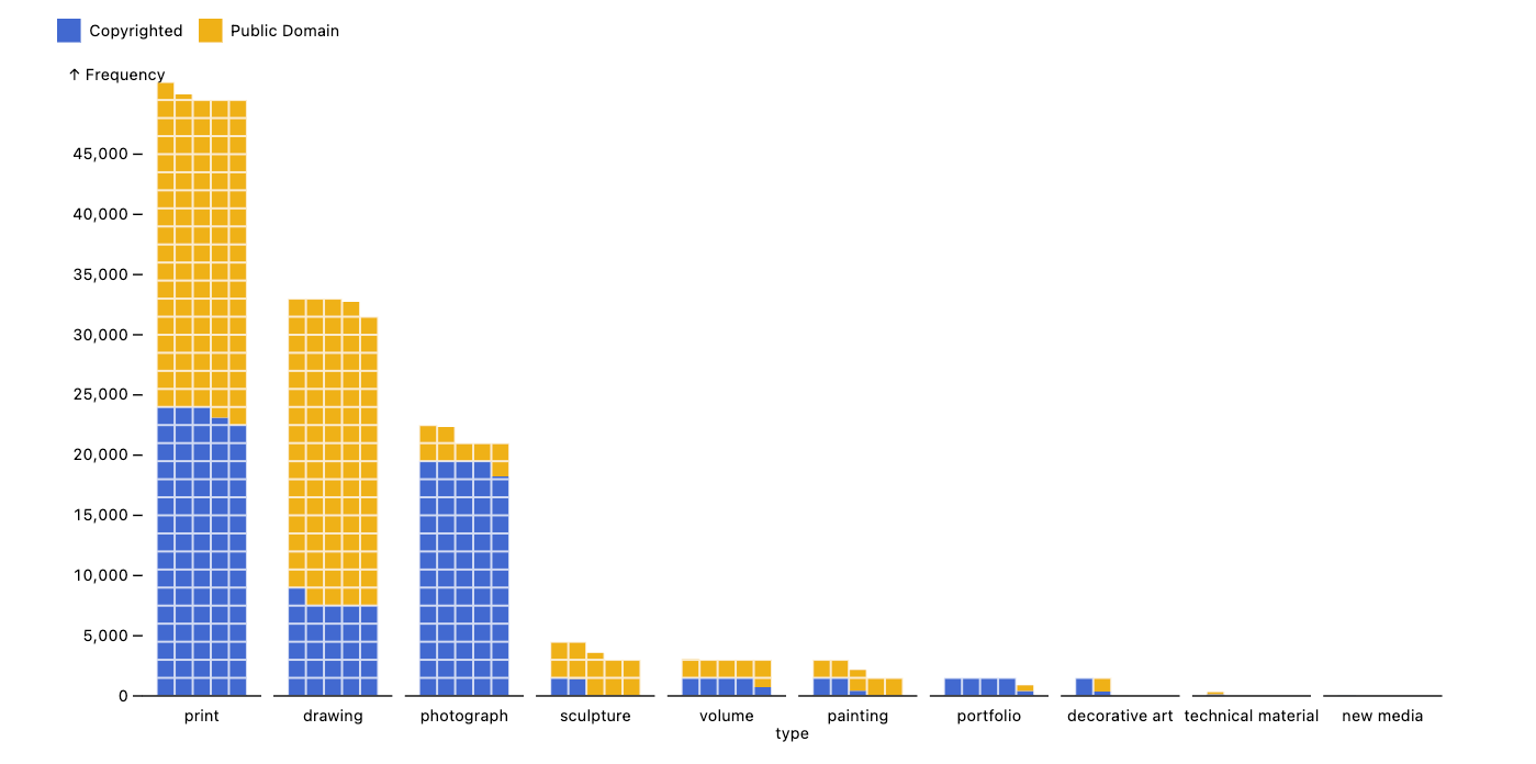
Right away, we can see that prints, drawings, and photographs make up most of the collection. Each category varies in how many images are public domain — images of prints, drawings, sculptures, and paintings are mostly public domain, while images of photographs and portfolios are largely copyrighted.
We can get more granular in our plot very easily with Observable Plot, which is composable and expressive. With just a few tweaks, you can completely change how the data is represented. For example, starting from the plot above, we can modify marks and some encoding fields and produce an entirely different chart, allowing for quick exploration and iteration — like this “waffle” bar chart.
Plot.plot({
  width: 900,
  marginLeft: 50,
  color: { legend: true },
  marks: [
    Plot.waffleY(
      /* changed, Plot.barY */
      records,
      Plot.groupZ(
        /* changed, Plot.groupX */
        { y: "count" },
        {
          fx: "type",
          fill: (d) => d.public ? "Public Domain" : "Copyrighted",
          sort: { fx: "-y" }, /* changed, sort: { x: "-y"  } */
          unit: 300, /* new */
        },
      ),
    ),
    Plot.ruleY([0]),
  ],
  document,
});
With both Polars and Plot, we can ask more specific questions about the data, such as “Which artists have the most artwork in the collection?” Here, we first use Polars to group the data by artist (“name”) and whether the artwork is public domain (“public”), counting the number of works for each. Then, we use Plot to visualize the top 25 artists.
const artworkTotals = df
  .groupBy("name", "public")
  .len()
  .sort("name_count", true)
  .head(25)
  .toRecords();

Plot.plot({
  marginLeft: 200,
  color: { legend: true },
  marks: [
    Plot.barX(artworkTotals, {
      x: "name_count",
      y: "name",
      sort: { y: "-x" },
      fill: (d) => d.public ? "Public domain" : "Copyrighted",
    }),
  ],
  document,
});
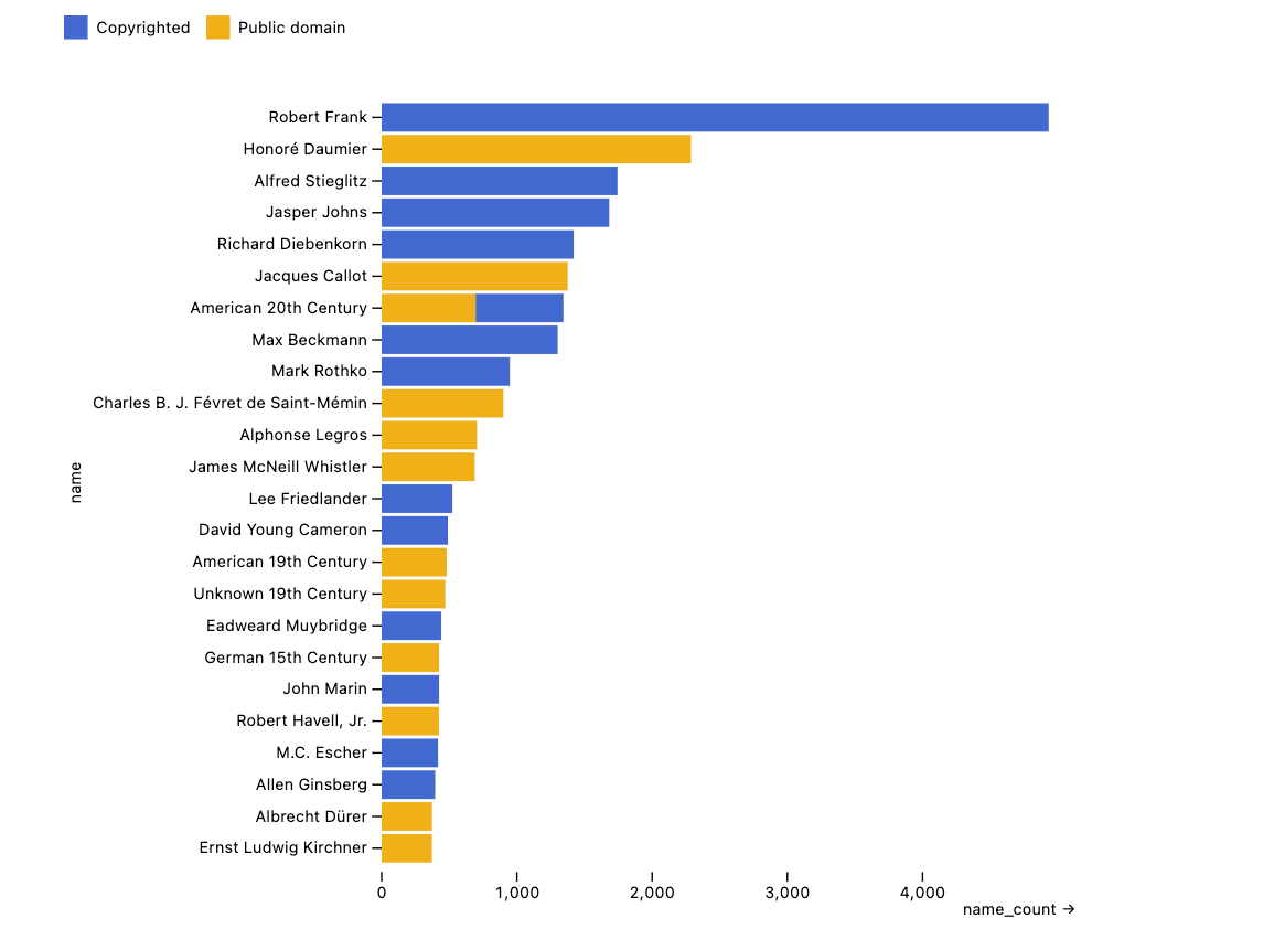
Again, we can draw some high-level takeaways from this plot: The photographer Robert Frank has nearly twice as many works as the next highest artist. Some entries, like “American 20th Century” and “German 15th Century,” represent groups rather than individuals. Additionally, an artist’s work is typically either entirely public domain or not at all — likely because public domain status is determined at the collection level, with institutions clearing entire groups of works at once rather than evaluating individual pieces separately.
With our tidy and clean dataset, we can quickly iterate in Deno to ask both broad questions (“What even is in this collection?”) and very specific ones (“Who created this artwork in a given year?”).
Deeper exploration with interactivity
So far, we’ve used static plots to explore our data, but Jupyter notebooks support rich, interactive outputs using HTML, CSS, and JavaScript.
With Deno, we can add more interactivity to our data exploration by either using off-the-shelf interactive anywidgets by quickly building custom components for visualizing subsets in ways prebuilt tools don’t support. Deno provides direct access to the full web ecosystem, making custom visualizations seamless.
In this section, we’ll look at:
- Prebuilt interactive table anywidgets for exploring data
- Create custom
component to visualize subsets of the dataset
Exploring data with DataFrame viewer anywidgets
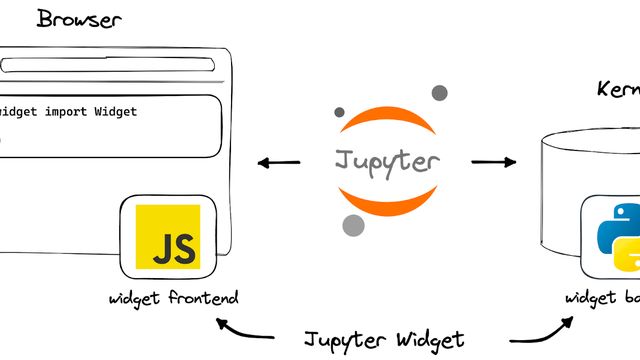
In Jupyter, “widgets” extend notebook outputs with interactive views and controls for objects in the kernel (i.e., backend). Unlike standard outputs, they consist of both kernel-side and front-end code, communicating directly via custom messages. While the Jupyter Widget ecosystem is largely Python-centric, the anywidget project provides a kernel-agnostic way to create and share these components.
With anywidget, widgets can be published to JSR and used in the Deno Jupyter kernel. For example, jsr:@manzt/jupyter-helper provides some off-the-shelf anywidgets for interactively viewing Polars data frames.
import { agGrid } from "jsr:@manzt/jupyter-helper";

agGrid(df.head(200)); // just look at the first 200 items
The agGrid export renders the pl.DataFrame using the popular AG Grid library, allowing for interactive sorting, filtering, and pagination. This default view is minimal but can be easily extended with AG Grid’s many features.
import { quak } from "jsr:@manzt/jupyter-helper";

const paintings = df.filter(pl.col("type").eq(pl.lit("painting")));
quak(paintings);
The quak export renders the pl.DataFrame with the quak data table viewer. Like agGrid, it also includes summary visualizations above each column, showing 1D distributions, and can scale to much more data (e.g., the entire collection). These 1D summary visualizations are interactive, enabling cross-filtering across columns.
Together, the programmatic and interactive layers enable unique hybrid workflows working with data. Some queries are easier to express in code, while others are more intuitive through direct manipulation. In notebooks, the two approaches come together naturally.
For example, Polars can be used to subset the data to just public domain paintings (~2k out of ~115k artworks), and then a date range can be selected interactively by brushing in the UI to explore variation across other columns.
Creating a custom
Deno gives us direct access to the web ecosystem, making it easy to build small, useful UIs for exploring our data in ways that off-the-shelf tools don’t support.
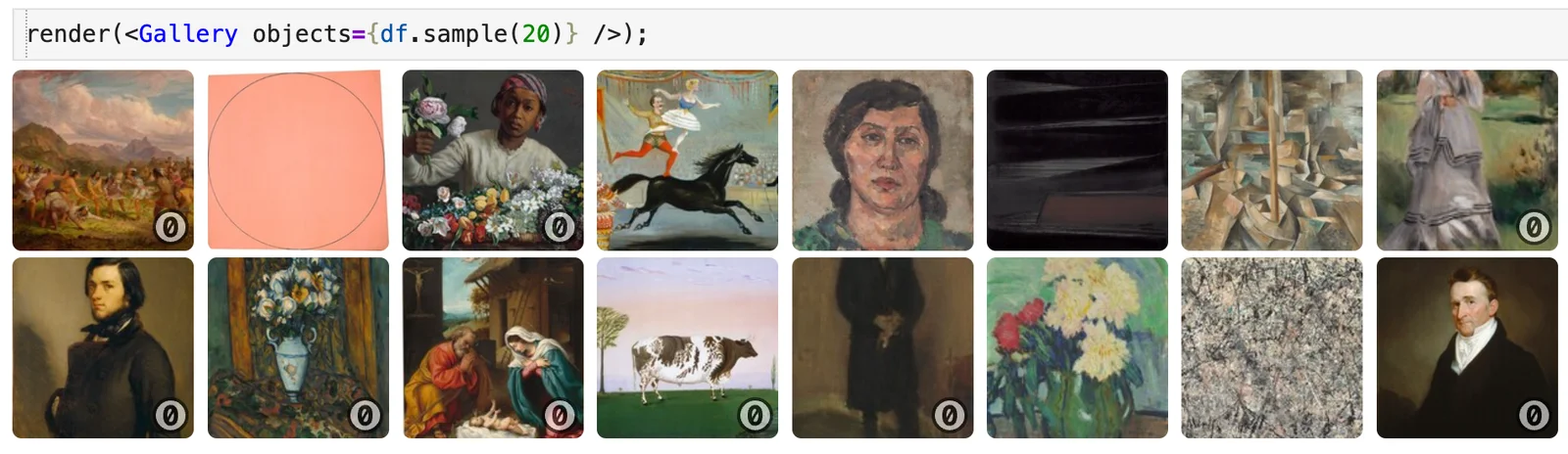
For example, it would be helpful to actually see a set of artwork in a “gallery view” to provide intuition about what’s in that subset. We can do that since the dataset contains image URLs.
Let’s create a custom JSX component that server-side renders (SSR) a gallery view for any dataset subset using the render export from jsr:@manzt/jupyter-helper. This helper simply converts JSX to an HTML string, which we display using the Deno.jupyter.Displayable interface.
import * as React from "npm:react";
import { render } from "jsr:@manzt/jupyter-helper";

function Gallery({ objects, size = 100 }) {
  return (
    <div
      style={{
        display: "grid",
        gridTemplateColumns: `repeat(auto-fill, minmax(${size}px, 1fr))`,
        gap: "4px",
      }}
    >
      {objects.select("objectid", "thumburl", "title", "public")
        .map(([objectid, thumburl, title, publicDomain]) => (
          <div
            key={objectid}
            style={{ position: "relative", textAlign: "center" }}
          >
            <a
              href={`https://www.nga.gov/collection/art-object-page.${objectid}.html`}
              style={{
                display: "block",
                width: `${size}px`,
                height: `${size}px`,
                position: "relative",
              }}
            >
              <img
                src={thumburl}
                alt={title}
                style={{
                  width: "100%",
                  height: "100%",
                  objectFit: "cover",
                  borderRadius: "5px",
                }}
              />{" "}
              {publicDomain && (
                <img
                  src="https://mirrors.creativecommons.org/presskit/icons/zero.svg"
                  alt="Public Domain"
                  style={{
                    position: "absolute",
                    bottom: "3px",
                    right: "3px",
                    width: "20px",
                    height: "20px",
                    opacity: 0.60,
                  }}
                />
              )}
            </a>
          </div>
        ))}
    </div>
  );
}
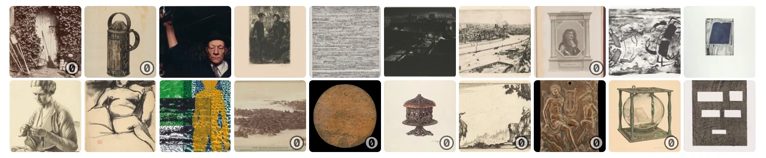
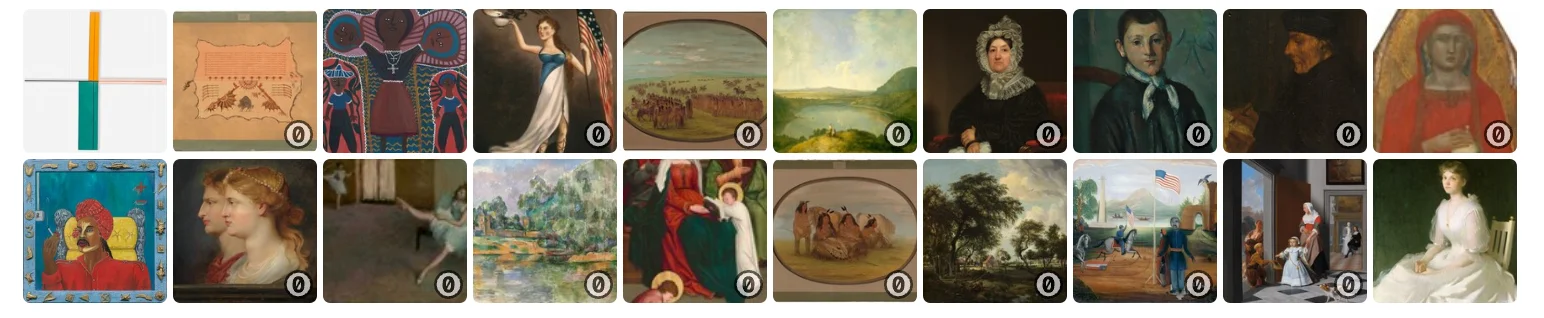
Gallery is a custom component that displays a grid of artwork thumbnails from a given dataset. Each image links to its NGA collection page, and public domain works are marked with a CC0 icon.
We can SSR Gallery with our data to better understand a smaller subset, making it easier to explore specific artists, time periods, or categories visually. For example, a random sample from all the collection:
render(<Gallery objects={df.sample(20)} />);
Or sample of just paintings:
render(<Gallery objects={paintings.sample(20)} />);
It’s worth taking a moment to appreciate that in just a few lines of code, we’ve built a domain-specific utility that makes our data more intuitive to explore. This kind of flexibility is powerful and unique to Deno, letting us quickly craft custom utilities that provide deeper insights.
With our toolkit, let’s take a closer look at the NGA dataset:
Drilling down on when the art was created
So far, our data exploration has focused on high-level summaries of the NGA collection by artist and artwork type using static plots. Now, let’s drill down into something potentially more interesting using both our complete toolkit: when these works were created.
We’ll start with a stacked histogram to see the overall distribution of artwork types over time, then facet by public domain status to uncover any patterns.
Plot.plot({
  y: { grid: true },
  color: { legend: true },
  marks: [
    Plot.rectY(
      records.filter((r) => r.year > 1401), // 15th century or later
      Plot.binX({ y: "count" }, {
        x: (d) => new Date(d.year, 0, 1),
        fill: "type",
        fy: (d) => d.public ? "Public Domain" : "Copyrighted",
      }),
    ),
    Plot.ruleY([0]),
  ],
  marginLeft: 100,
  marginRight: 100,
  width: 1000,
  height: 400,
  document,
});
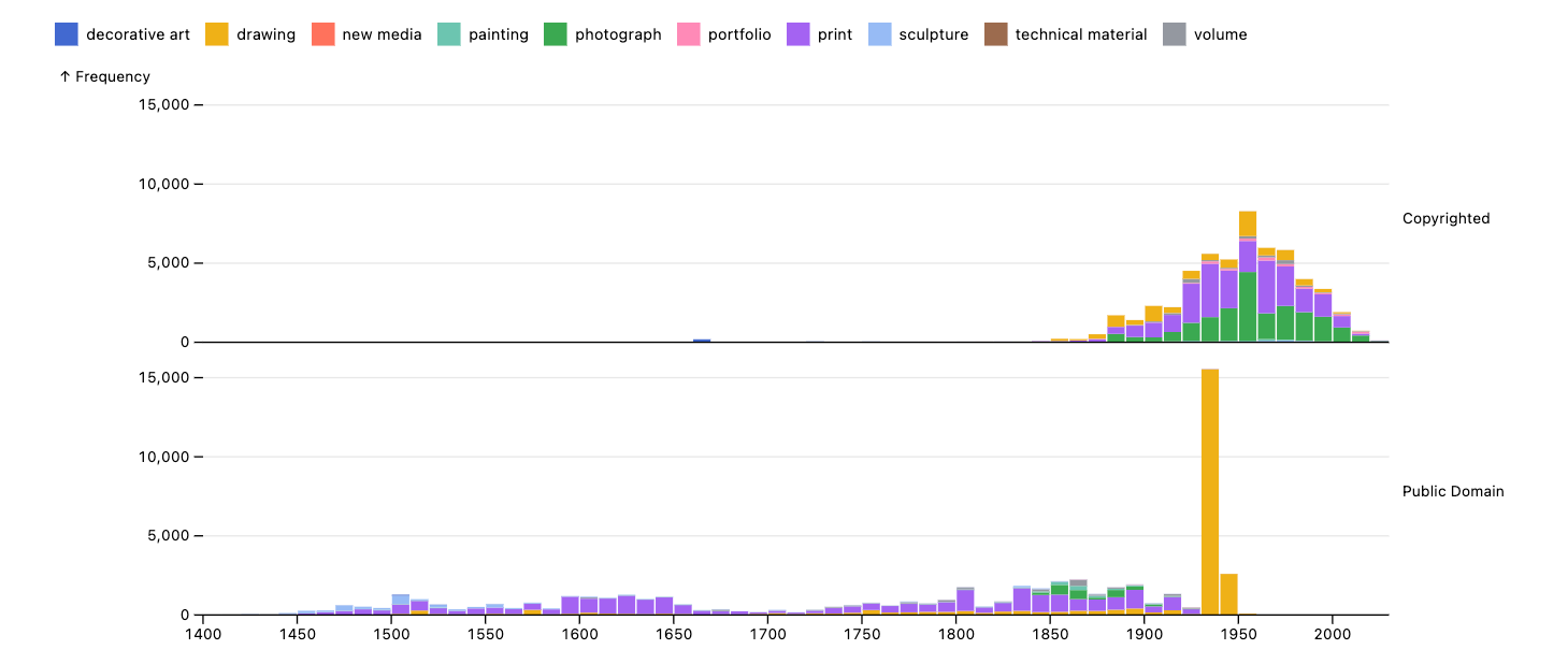
The distribution of artworks with copyrighted and public domain images are noticeably different. Nearly all copyrighted works appear after 1850, while public domain artworks are more evenly spread over time — except for a sharp spike in public domain drawings from the 1940s, with over 15k artworks added.
This is a striking anomaly. Are they all from the same artist? Why only drawings? Let’s take a closer look.
We’ll filter down the public domain data to this span.
let notablePeriod = df.filter("public") // just public domain
  .filter(pl.col("year").gt(pl.lit(1925))) // between 1925 - 1955
  .filter(pl.col("year").lt(pl.lit(1955))).sort({ by: "year" });

Plot.plot({
  y: { grid: true },
  color: { legend: true },
  marks: [Plot.rectY(
    notablePeriod.toRecords(),
    Plot.binX({ y: "count" }, {
      x: (d) => new Date(d.year, 0, 1),
      fill: "type",
    }),
  )],
  document,
});
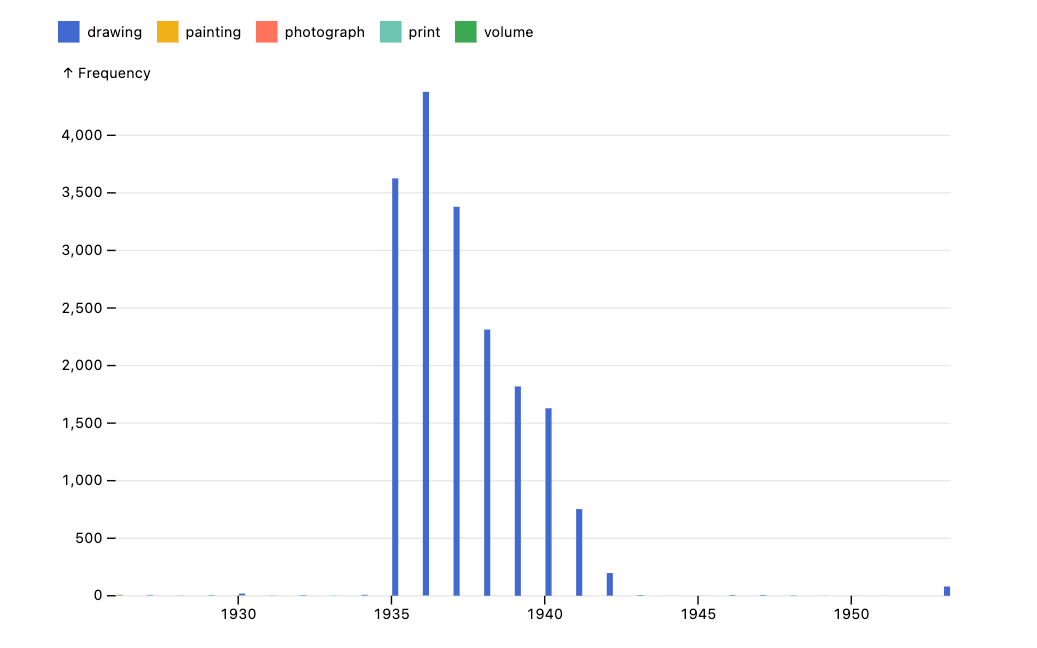
Zooming into the 1925–1955 range, we see that almost all the data falls within a much narrower window. Interestingly, the spike is highly concentrated between 1935 and 1942, with very little artwork outside this period.
Narrowing in closer, we can see that in this window there are ~18k individual drawings:
const totalNumberOfDrawings = notablePeriod
  .filter(pl.col("year").gt(pl.lit(1934)))
  .filter(pl.col("year").lt(pl.lit(1943)))
  .shape
  .height;

totalNumberOfDrawings; // 18096
made by over 1000 individuals:
const numberOfArtists = notablePeriod
  .filter(pl.col("year").gt(pl.lit(1934)))
  .filter(pl.col("year").lt(pl.lit(1943)))
  .groupBy("name")
  .len()
  .shape
  .height;

numberOfArtists; // 1034
This gets even more interesting! The artwork is not from just one specific source — there was a surge of public works between 1935 and 1942.
Let’s use our custom
render(<Gallery objects={notablePeriod.sample(100)} />);
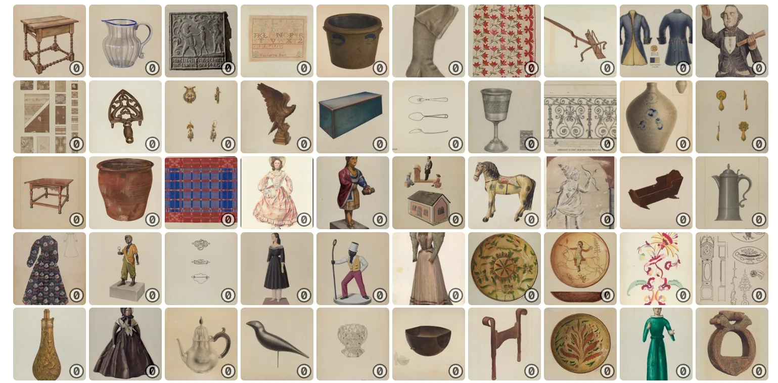
So all these artworks, despite being from different individuals, have a very similar style and medium. That’s something worth digging into — what might explain this pattern?
Thanks to our custom
Conceived as an effort to document and preserve American folk and decorative arts, the Index of American Design consists of 18,257 watercolor renderings created between 1935 and 1942 as part of a Federal Art Project (FAP) work-relief program. Around 400 artists meticulously recreated textiles, woodcarvings, weathervanes, and other objects from across the U.S., aiming to establish a distinct American visual lineage. The project was ultimately housed at the National Gallery of Art, becoming a widely exhibited visual archive.
That’s it! We found a large collection of public works funded by a federal program during the Great Depression — clear in both the data and historical context.
Conclusion
Using Deno’s Jupyter kernel, we explored the NGA Open Access dataset, combining static plots, interactive widgets, and custom JSX components to uncover patterns in the data. This led us to a historical insight — the Index of American Design, a public art project from the 1930s.
With Deno, JSX, and anywidget, we combine data analysis with interactive web-based visualization, making it easy to build domain-specific tools for deeper exploration.